Schwarzenegger is not just following a national trend to cut higher ed
Is the privatization of UC just part of a national trend beyond the control of UC leadership and Governor Schwarzenegger?
No.
In a September 27, 2009, New York Times interview UC President Mark Yudof was asked: “UC is facing a budget shortfall of at least $753 million, largely because of cuts in state financing. Do you blame Governor Schwarzenegger for your troubles?” Rather than holding Schwarzenegger accountable for the massive cuts he has imposed on UC and CSU, Yudoff responded: “I do not. This is a long-term secular trend across the entire country. Higher education is being squeezed out. It’s systemic.”
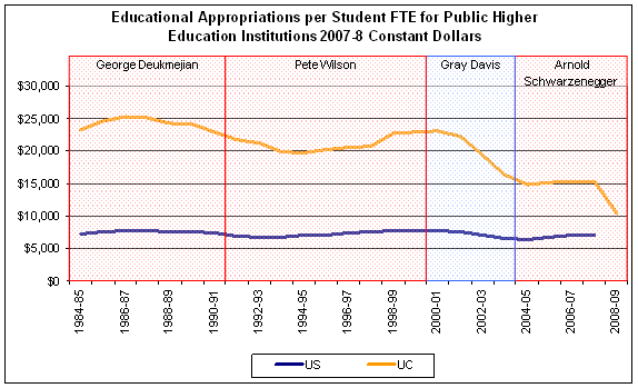
This is a commonly repeated trope, but is it true? No. The blue line in the chart below tracks the amount of money per student (FTE), adjusted for inflation that all of the states’ public higher education systems have spent over the last three decades: the line fluctuates a bit but does not descend. In contrast, the gold line, which represents the State of California’s real spending per UC student drops markedly after 2002. (The gold line is far above the blue line because UC is a Tier 1 four-year university; the blue line traces the national average for all public higher education, including two-year community colleges.) This chart shows the rapid decline in state support for UC students is not typical of a national trend.

Sources: State Higher Education Executive Officers, California Legislative Analyst’s Office.
Since Arnold Schwarzenegger became Governor of California, state funding of UC, per student, has dropped 30 percent. The state contributes less than half of what it did a decade ago
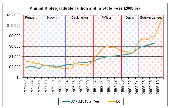
As envisioned in the Compact for Higher Education between the Governor and UC and CSU, UC has, for all practical purposes, abandoned the California Master Plan for Higher Education and is rapidly privatizing by dramatically shifting costs on to students. The chart below indicates that, adjusted for inflation, UC tuition (gold line) is well ahead of the rising curve of public four-year university tuitions (blue line) across the country. UC is not just following a national trend.

Sources: College Board, California Post Secondary Education Commission
This tuition chart also punctures the idea that UC tuition (and fees) is well below other public universities. While UC tuition tracked the average of other four year public colleges in the past, it increased dramatically faster in response to large cuts imposed by Republican Pete Wilson, recovered for a time under Democrat Gray Davis, then exploded after Gov. Schwarzenegger’s forced his Compact on UC and CSU in 2004-5. By 2008-9 UC cost students and parents 22 percent more than the national average. If the trend-line for all states continues in the 2009-10 and 2010-11 years, then UC tuition will be twice that of the average public university.
The red and blue bands demonstrate that gubernatorial party affiliation is not a strong predictor of support for higher education. Past Democrats have been both good and bad, as have past Republicans. In terms of cutting public support and transferring costs to UC families, however, Gov. Schwarzenegger is in a league of his own.

In graph 1, shouldn’t you compare Tier 1 public universities with each other instead of UC to all other public colleges, including 2-year community colleges, and universities. These are very different and the comparison only means that the blue line includes a lot of cheaper schools than UC because they are different and produce a different product.
The comparison in graph is appropriate, since the statement President Yudof made is that the cuts are “a long term trend across the entire country.” The data do not support that statement.
In addition, graph 1 shows that the Governor is pushing UC funding down to the national average of all colleges (including the community colleges). For the reasons you note, that is no way to maintain UC as a Tier 1 institution.
Finally, we looked for the data you suggest and could not find it from an authoritative source. If you can locate data on all the Tier 1 four year universities, we would love to have it.
But, as noted above, the comparison in graph 1 is the appropriate data for the question at hand.
You assume that Yudof meant all community colleges, 4-yr colleges and universities, research universities of all stripes and tier 1 universities. I assume he meant comparable universities, i.e., tier 1. Other than your weak justification, how can you compare two-year community colleges and UC? They are very different and the cc’s charge far less than UC and always have for those differences. Do you expect that students at all of these should pay the same amount? The products, aims and goals of these different types of education are different and the costs differ as well. Not a good comparison. Get the tier 1 data, so we have a meaningful comparison. Separate the privates from the publics at least in one graph.
Yudof said: “This is a long-term secular trend across the entire country. Higher education is being squeezed out. It’s systemic.”
Here’s more information on this issue: “a study by the Urban Institute showed that higher education’s share of
state appropriations nationwide fell from 6.7 percent to 4.5 percent in the last quarter of the Twentieth Century. More recently, steady or slightly-declining appropriations, in real dollar terms, have not kept up with increasing enrollments. A study by the State Higher Education Executive Officers Association found that per-student allocations fell to $5,721 from $6,874 in the first half of the 2000s,
reaching its lowest level in twenty-five years.” From: “Current Budget Trends and the Future of the University of California”, a 2006 Report to the Academic Council of UC made by a 12-faculty committee representing all campuses. It was forwarded to then-President Dynes. In addition, the data presented in this report better explain the curve shown in graph 2 as well. This report anticipated our current problems and proposed solutions. Read it: http://www.universityofcalifornia.edu/senate/reports/futures.report.0706.pdf
Edward, Stan was one of the authors of the report you just cited! Your point about using getting research-U data is well-taken, but the reconciliation of the quote from SHEEO and the semi-flat line in Stan’s chart is that Stan is not correcting for enrollment growth and the SHEEO number does – it’s “per student.” The detailed work with the data will continue to evolve –
Edward, the graph above uses the exact same SHEEO data you refer to. Indeed, the blue line representing average US appropriations for higher education does decline in the early 2000’s as the “Futures” report you refer to describes. However, the “Futures” report was written in early 2006. Since that time the US figure has rebounded considerably. Over the entire period of time available from SHEEO (FY 1980-81 to FY 2007-08), state appropriations have actually climbed 18%.
It is also worth pointing out that while US appropriations fell 17.5% from peak 1999-00 to trough 2004-5, California’s appropriations fell 35% in that same period. And while appropriations nationwide recovered, appropriations in California did not.